
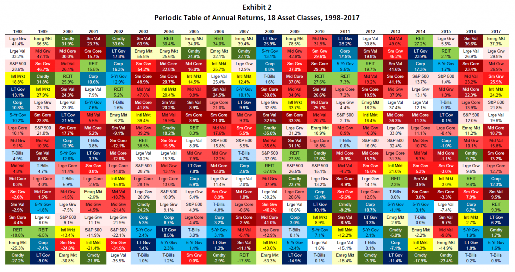
The chart below might look familiar to you. It was created by the Callan Institute and goes by various names, such as a periodic table or quilt chart. This first one shows annual returns by asset class and looks totally random—at least I can’t detect a pattern. It shows the importance of diversifying one’s portfolio.
But check out this next chart. It shows the same asset classes, but with 30-year rolling returns. It’s far less random, with a couple of clear takeaways: bond categories have never shown up in the top half, and stock categories rarely show up in the lowest ranks.
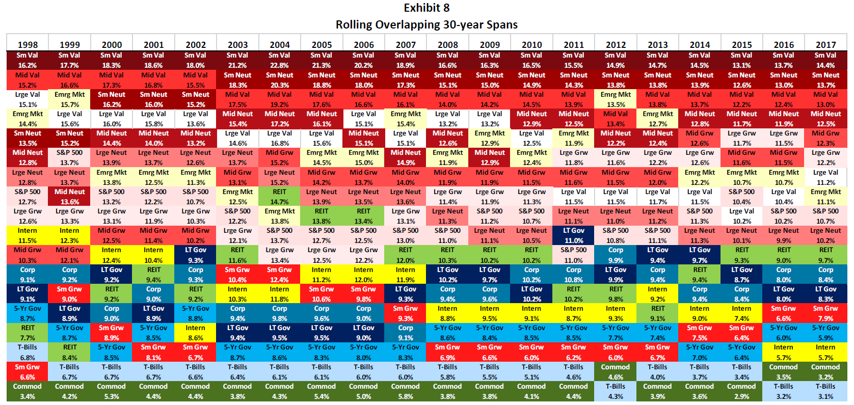
The first chart points out the importance of diversification—and stop your guessing, already, as to which category is going to do well in any one year; it’s unknowable. The second chart suggests that, if you’re investing for the long run, your portfolio should be heavily tilted toward stock funds. Couple both of those with a disciplined rebalancing strategy and you’ve got the makings of a good investment strategy. It’s no guarantee of success, but it is stacking the odds in your favor.
Content in this material is for general information only and not intended to provide specific advice or recommendations for any individual. All performance referenced is historical and is no guarantee of future results. All indices are unmanaged and may not be invested into directly.
All investing involves risk including loss of principal. No strategy assures success or protects against loss.
Past performance is no guarantee of future results.
There is no guarantee that a diversified portfolio will enhance overall returns or outperform a non-diversified portfolio. Diversification does not protect against market risk.
Please note that rebalancing investments may cause investors to incur transaction costs and, when rebalancing a non-retirement account, taxable events will be created that may increase your tax liability.