The Global Risks Report for 2018 from the World Economic Forum is available here and includes several graphics that allow complex events to be visualized, which is great for those of us who prefer the visual, present company included.
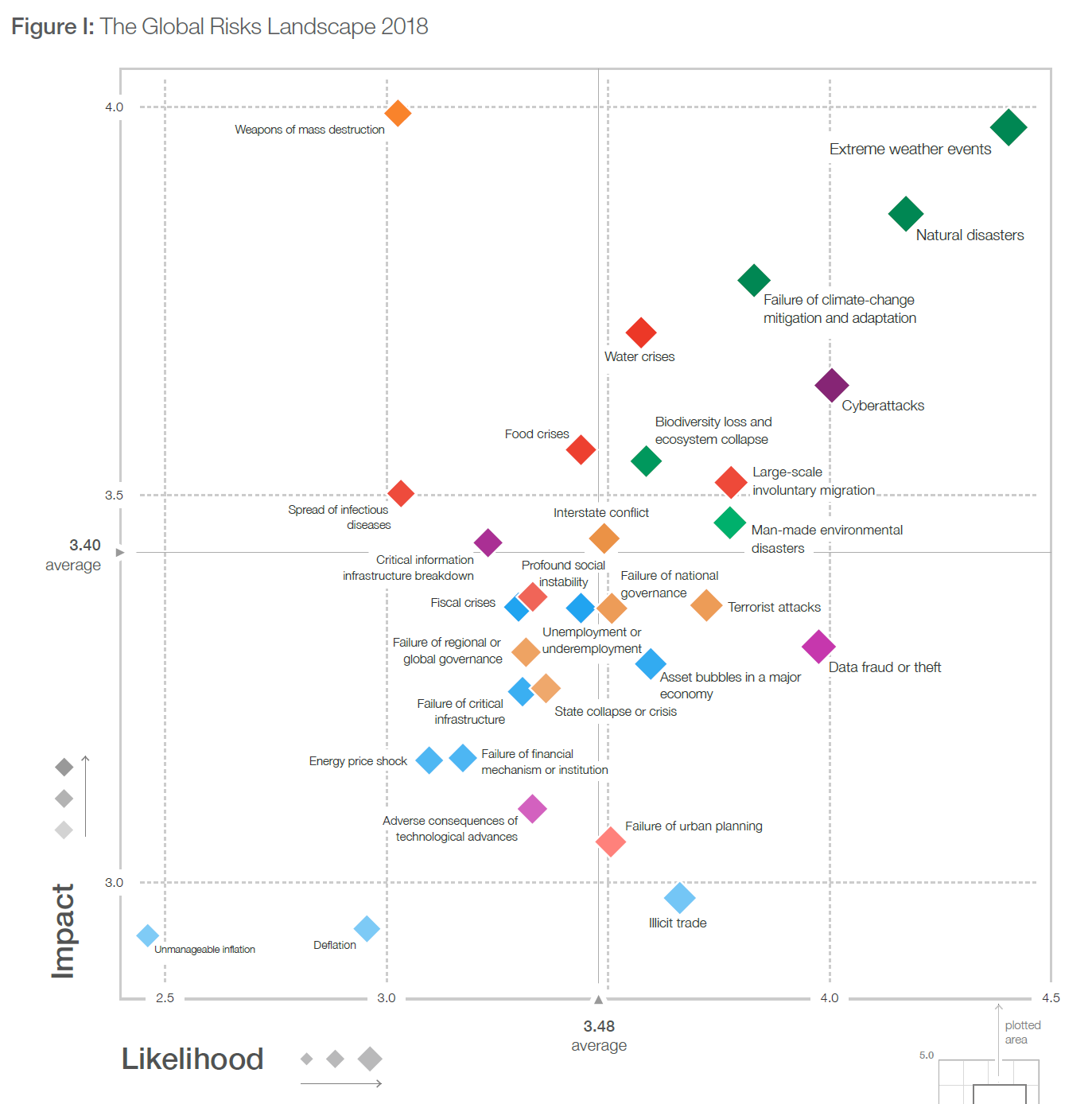
Blue – Economic Risks; Green – Environmental Risks; Orange – Geopolitical Risks; Red – Societal Risks; Purple – Technological Risks
Here is one that shows, on the horizontal axis, the likelihood of events (farther to the right…more likely) and the impact on the vertical axis (higher up…the greater the impact.) I started to highlight those likely to impact investors, such as asset bubbles, when I realized that almost all of these would have at least some impact investors, even if different than the vertical placement on the chart.
Here’s another. The chart below shows the interconnected-ness of several trends and their risks. You can see the size of the trends by the size of the…I don’t know what that is, an elongated diamond (?) at the edge, and how and where the trends interact.
Admittedly, almost everything in this report is a forecast, and they’re almost always wrong, but the report is interesting to contemplate. It’s available here.
The opinions voiced in this material are for general information only and are not intended to provide specific advice or recommendations for any individual. Any economic forecasts set forth may not develop as predicted.
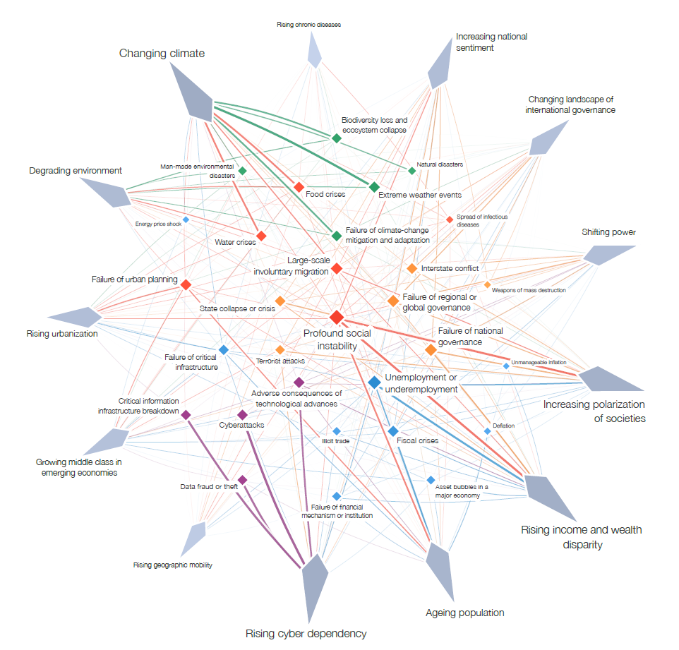
Blue – Economic Risks; Green – Environmental Risks; Orange – Geopolitical Risks; Red – Societal Risks; Purple – Technological Risks